CRO: Drove Significant Increase in Conversion Rate Through Layout & Design Testing
Directing new users to a thoughtfully designed "welcome" page focused on subscription benefits significantly increased subscriber sign ups for this niche newsletter.
75%
new subscriber sign ups
66%
ecommerce transactions
Challenge
How could conversion rate optimization help this niche newsletter reverse a decline in new user subscriptions?
Our Approach
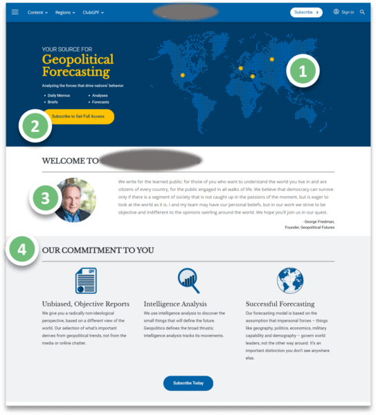
Redirected new users to a “Welcome” page where design and content focus on subscription benefits:
- Engaging, interactive map with featured news around the world
- Large CTA button at the top to “…Get Full Access”
- Quote from founder and well-known journalist George Friedman
- Commitments that make this source better than traditional news
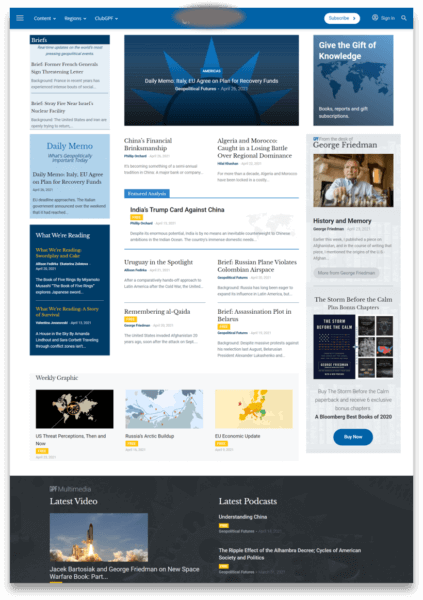
Original

Improved Version

Read more about our conversion rate optimization company and experience or use our CRO calculator to see what a difference CRO could make to your results.
Want to know more? Contact us to talk about your company’s digital marketing needs.

