Onsite SEO for Offsite Sales
How we helped a landscaping materials company optimize their site’s code, visibility, and user experience, improving onsite SEO for offsite sales
The site’s technical health, navigation, architecture, and content damaged rankings and user experience; it would undergo a front-end redesign and a comprehensive relaunch during our engagement
Fix all technical issues for easy search indexing, refine navigation to direct users to and through conversion paths, increase visibility for product terms most used by customers
Because of the sheer size of the products, the company avoided ecommerce, instead directing visitors to physical locations where they could acquire the materials. The goal of their conversion journey was for a user to visit their “Where to Buy” page, search for a nearby retailer, then leave the site, presumably to go get the materials.
Audit
The client engagement began with an in-depth audit of their website’s code, organization, content, and user experience. We also examined their offsite presence, including social profiles and backlinks. And most importantly, we analyzed their goals and strategy for SEO, investigated the competitive landscape, and conducted thorough keyword research.
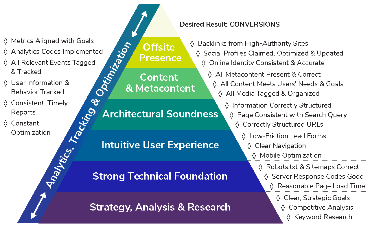
Through our years of experience in optimization, we have developed a model of an ideal SEO approach:
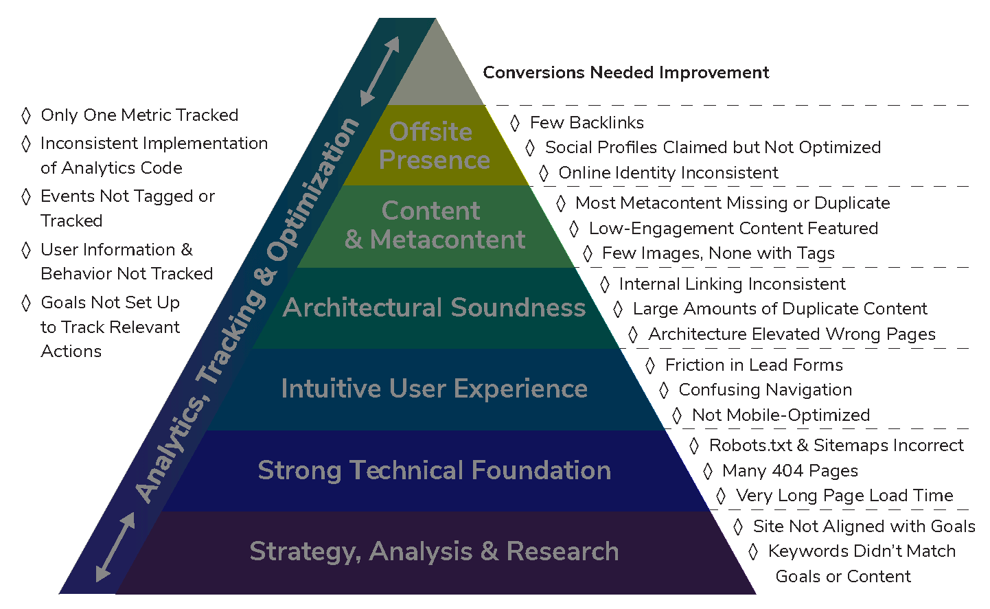
Audit results
While the client’s in-house team had done many things right, their SEO still had room for improvement.
Technical SEO
Previous efforts had focused on blogging – which is definitely important for growing quality organic traffic – but had neglected the technical aspects of the website that were undermining all the work the client had done.
Technical SEO isn’t just about improving how a website’s code appears to search engine bots; most technical improvements will also enhance the user experience:
- Unique, informative titles and meta descriptions help search bots index a site’s pages—and because these titles and descriptions are what visitors see on the search engine results page (SERP), they provide crucial information that can sway the decision to click on a result
- Pages that load quickly boost SEO performance—and keep visitors happy. A slow-loading page is a soon-abandoned page
- A website free of server status error codes (302/7, 404, 5XX) signals health and stability to a search engine—and doesn’t frustrate visitors
Unfortunately, the company’s website had issues in all the categories listed above, providing many opportunities for improvement:
- Many pages lacked correct title tags, and while some had meta descriptions, they were often duplicated throughout the site
- Inefficient code, including un-compacted JavaScript, non-compressed images and un-leveraged browser caching, caused page load speed to be needlessly slow
- 17% of the site’s pages returned a 404 Page Not Found server code
User experience
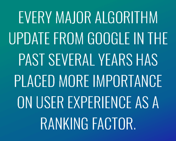 It might seem that user experience (UX) has no relevance to search engines, but that’s not the case. Every major algorithm update from Google in the past several years has included more sophisticated tools to measure UX and placed more importance on UX as a ranking factor. Search engines can grade a page’s content, gauge the likelihood that a page will meet the user’s needs, and even “read” a page’s layout.
The client’s site had several issues that damaged the user experience and thus SEO as well:
Several layers of navigation (top menu, side menu, bottom menu) made for a confusing layout and a very confusing user experience, especially as these menus all had a few items in common. One clear navigation option establishes prioritization of the most important categories or topics on a site for search engines and searchers alike
The lack of an internal search function made it difficult for visitors to find information once they were on the site. Visitors who use internal search tend to be more interested in the site’s topic and content than average users; entice these visitors to stay and engage further with a simple internal search option
Navigation between category pages could be very frustrating to users: multiple category-level pages pointed or linked back to other category pages or the subcategory pages of other categories. There was no apparent internal linking strategy, creating friction in the customer journey
Site architecture
Again, a well-structured site architecture boosts a site’s standing with bots and people; bots like knowing how a site is organized and people like knowing where to find their desired content. Additionally, organizational structure directs search engines on how to classify and rank the importance of a site’s pages.
Hierarchical architecture over-valued company-centric pages such as “About Us” while under-valuing conversion-oriented pages. This setup indicated, to both bots and people, that the most important information on the site was about the company rather than the user.
Content
As with technical SEO, content best practices appeal to search bots and users alike. A website full of unique content will perform much better than one with duplicate content, whether those duplicates occur within one site or in connection with another site.
Like many companies in their space, they had two markets: contractors and DIY homeowners. Thus, it made sense for them to have two separate websites. However, these sites were separate in name only; the content was identical. Not only was this harming their SEO performance, it was confusing to visitors.
There were also strategic issues with content. Previously, the company had prioritized providing education on their site; as a result, the site was full of informational pages. These pages contained useful info, but their visitor engagement metrics, including time on page and exit rate, were very disappointing. While these pages were important to the company, they weren’t offering what visitors were searching for.
Our keyword research identified gaps between relevant keywords and the actual content on the site. However, we also found irrelevant keywords were being tracked, diluting overall understanding of true website visibility in the company’s core focus areas.
Analytics and tracking
While the client recognized the importance of analytics, implementation of tracking codes and tags had been inconsistent. They were tracking the most important activity on their site: a user visiting the “Where to Buy” page. However, because that was the only activity they were tracking, it had no context regarding the rest of the site. Thus, they had no way to prioritize their content.
Fast Fixes
Because SEO is a long-term endeavor, “fast” in this context means within the first year of our engagement with the client.
Technical SEO
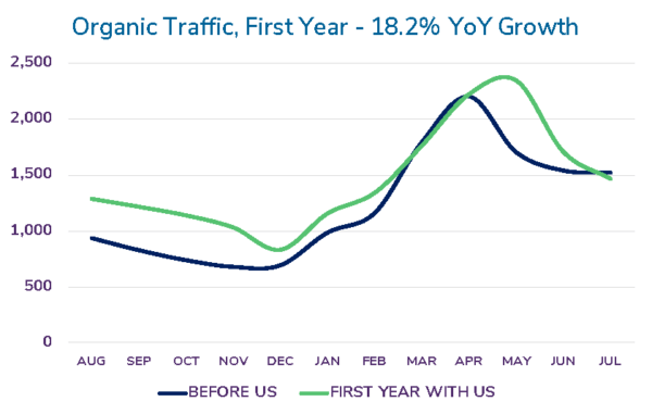 Seemingly simple technical fixes can have a significant impact on search-ability, visibility, and traffic.
- We fixed a major issue with the sitemap: new pages had been created but the sitemap.xml file hadn’t been updated to reflect this new content. While creation of a sitemap doesn’t directly cause search engines to index these pages, it is a positive signal to search engines that the pages are of enough quality to be indexed.
- We updated the site’s robots.txt file to give search engines more clear directions for how to crawl the site
- We recommended technical and back-end changes that reduced page load time from 6.7 seconds to 3.6 seconds
Goals, Conversions, and Tracking
Initially, the client tracked one metric along one dimension: the number of visits to the “Where to Buy” page. However, this gave them no insight into how users had reached the conversion page, nor of how they had interacted with the search tool on that page. We implemented three levels of tracking to improve the quantity and quality of data, so it could provide insights into how to support and enhance the buyer journey.
- We added goals to their analytics platform to measure user engagement with online design tools, design PDFs, and graphical content such as a product comparison chart
- By adding event tracking, we could identify the specific actions users took on a page, such as clicking “Search” for Where to Buy or “Submit” for a contact form
While the site’s purpose wasn’t e-commerce, they did sell design kits, which were almost as strong an indicator of purchase intent for the company’s main product line as usage of the “Where to Buy” page. So we added e-commerce tracking and funnel tracking to determine the user actions leading to a kit purchase.
Front-End Redesign
After our first year with the client, they gave their website a makeover to reflect our recommendations for people- and bot-friendly organization and user experience.
Improvements
- We updated the look and feel of the site to increase trust and user engagement
- We determined which content was most relevant to the site’s highest-traffic searches and featured that content instead of company-focused pages
- We assisted their web designers with back-end SEO, such as fixing a robots.txt file that was blocking the entire site
Results
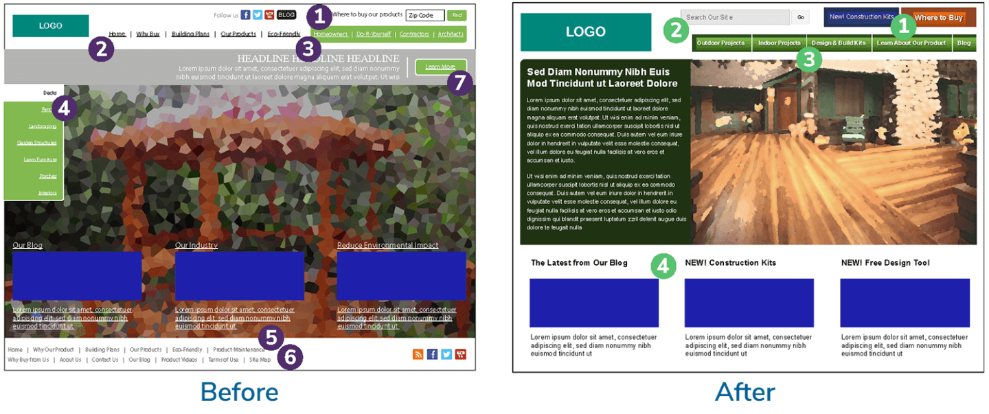
Before:
- This was the most important conversion on the site, but it was overshadowed by other elements on the page
- Top navigation
- Additional top navigation
- Side navigation
- Bottom navigation
- Bottom navigation included content links mixed with logistical links such as “Contact Us” and “Sitemap”
- “Learn More” is a murky call to action – plus this button competes with the primary “Where to Buy” CTA
After:
- The most important actions for users are now clearly marked with buttons in contrasting colors
- Internal site search to increase user engagement
- Just one navigation bar
- Featured content includes new conversion-oriented pages and regularly updated content on the blog
The Relaunch
 Almost 2 years into our engagement, the client was ready to relaunch their website in line with our recommendations. The previous year’s redesign focused on customer-facing factors, including page layout and on-page navigation to guide visitors to desired actions.
While there was a site redesign in the prior year, this was an actual relaunch, focused on the back-end aspects of the site: the code itself, its organization, URL structure and meta content, and all the other factors that are visible to search engine bots and contribute to visibility, ranking, and user experience.
This was a perfect opportunity to reorganize the site’s content, purge duplicate content, correct server codes, ensure perfect alignment between robots.txt files and sitemaps, and improve user flow. The overall health of the site saw an instant boost.
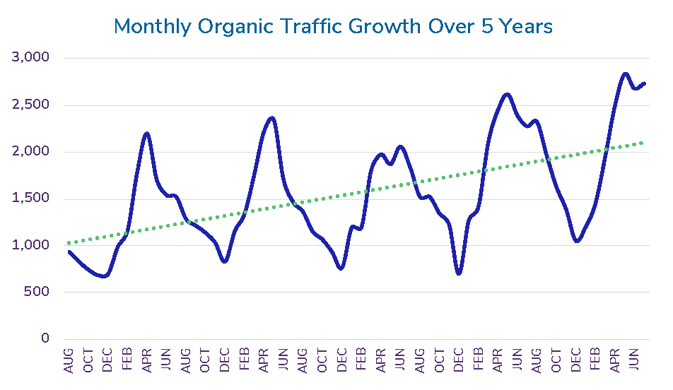
The relaunch occurred in April and May of our second year with the client. It’s common for websites to experience a “relaunch rebound,” a brief drop in traffic following a migration or major back-end relaunch, such as this one.
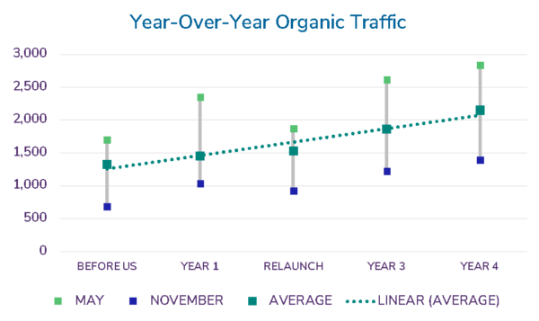
Post-relaunch, the client’s traffic was down 20.14% from May the previous year. However, the following month, traffic was up 20.62% from June the previous year. The “relaunch rebound” was short and quickly remedied, and organic traffic showed an average year-over-year growth of 30.75% for the next six months.
Keyword Rankings
While keyword rankings certainly don’t tell the whole story of SEO success, they do give clear insight into a site’s visibility for relevant keywords.
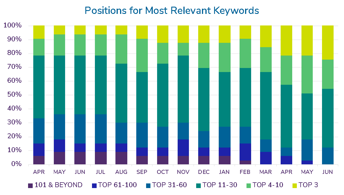
Over five quarters (15 months), we were able to move all the listings for the client’s most relevant keywords to position 60 and above, with 88% of them at position 30 or higher, and 46% in the top 10 results.
Note: Changes to search engine results page listings since 2016 have made it impossible to determine what page a listing would land on. Previously, positions 1-10 generally indicated that a listing would be on the first page; now, with the addition of many different types of featured results, even the top 3 positions aren’t guaranteed to land on page 1.
We also saw significant increases in the rankings for product-related keywords, which were most likely to drive conversions.
Conversions
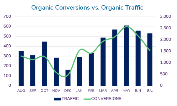 Not surprisingly, organic conversions fluctuated with organic traffic through the seasons, and both were affected by the relaunch in Q2 of Year 2. However, overall increased organic conversions even more than we increased organic traffic.
While the relaunch had a more drastic effect on conversions than on traffic, by Q1 of the following year, conversions had rebounded; in fact, that year would see an average 72.18% growth in conversions.
Overall Results
SEO is a long game, especially when demand for the product is extremely seasonal. Month-over-month or quarter-over-quarter metrics could look brilliant or dismal depending on which months or quarters are being measured. However, when viewed year-over-year, a strong, steady growth is clear.
Takeaways
SEO is a marathon, not a sprint. Any SEO consultant who promises to put your company on the first page of a search engine in two weeks or less should be questioned about their methods or avoided completely. Instead, the path to long-term, sustainable SEO growth is best achieved through a data-driven approach that looks beyond traffic and rankings to optimize for leads, sales, and revenue. This case captures several essential points of our SEO philosophy.
Never lose sight of the important metrics:
High position rankings are great for visibility, but it’s just as important to optimize a website’s content and user experience to maximize the return on the increased traffic through conversions. After all, traffic by itself won’t grow revenue or a company.
Invest the time, reap the rewards:
In most cases, it takes time to see the results from SEO. Visible changes can take anywhere from 6 to 12 months, depending on the technical and architectural issues of the existing site. However, that growth will be consistent and long-lasting, because it’s based on a strong technical foundation, alignment with strategic goals, and a deep understanding of user needs.
Always be testing and optimizing:
Never settle for “good enough” or “what worked before.” Keep seeking ways to improve performance, optimize the user experience, remove friction from the conversion process, and introduce beneficial innovations.

